UX Guidelines
These guidelines cover the best practices for creating extensions that seamlessly integrate with VS Code's native interface and patterns. In these guidelines, you can expect to find:
- An outline of VS Code's overall UI architecture and elements
- Recommendations and examples for UI contributed by an extension
- Links to relevant guides and samples
Before diving into the details, it's important to understand how the various architectural UI parts of VS Code fit together and how and where your extension could contribute.
Containers
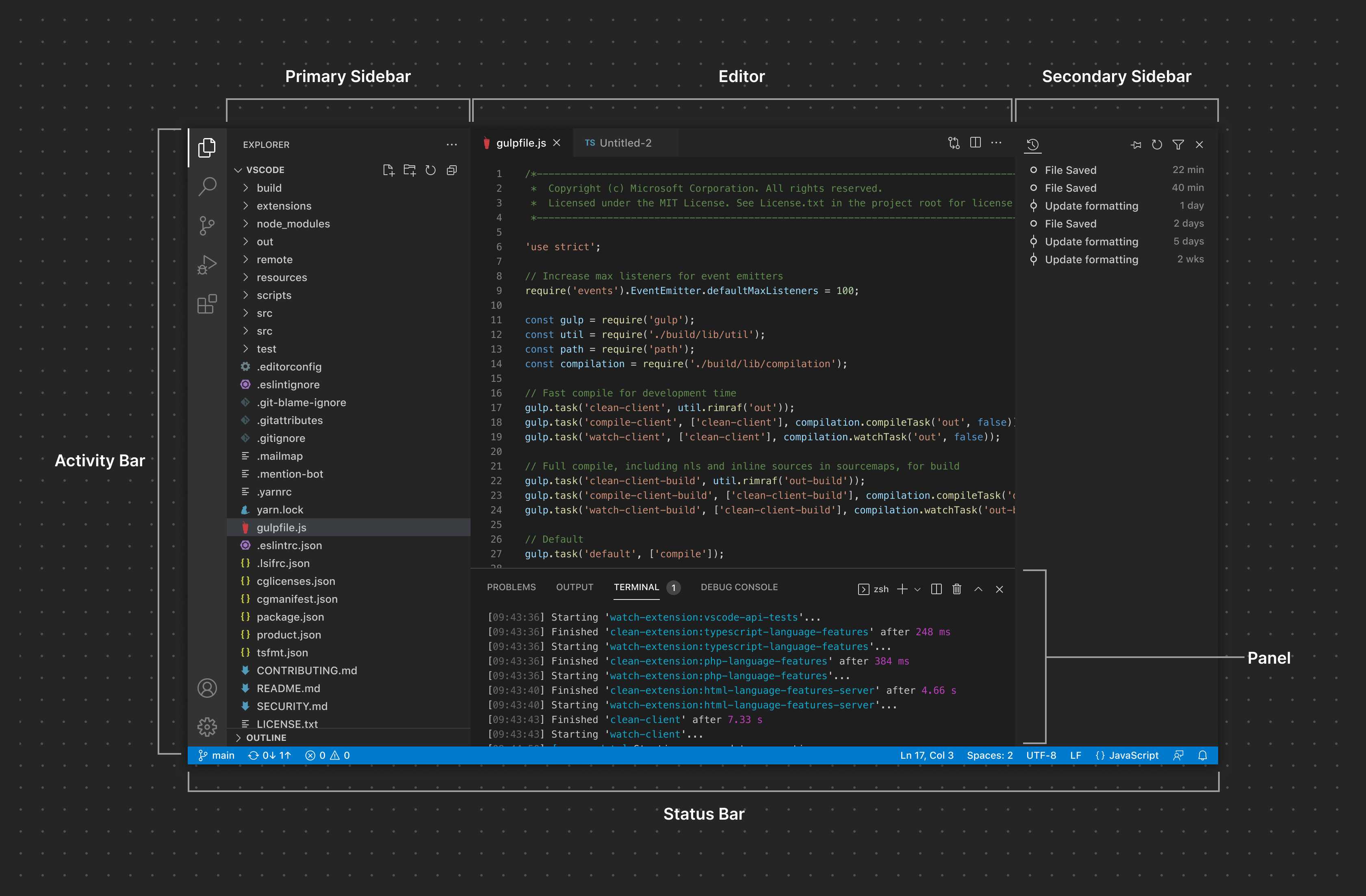
The VS Code interface can roughly be divided into two main concepts: containers and items. Generally speaking, containers can be considered the larger sections of the VS Code interface that render one or more items:
Activity Bar
The Activity Bar is a core navigation surface in VS Code. Extensions can contribute items to the Activity Bar that function as View Containers that render Views in the Primary Sidebar.
Primary Sidebar
The Primary Sidebar renders one or more Views. The Activity Bar and the Primary Sidebar are tightly coupled. Clicking on a contributed Activity Bar Item (read: View Container) opens up the Primary Sidebar where one or more View associated with that View Container will be rendered. A concrete example would be the Explorer. Clicking on the Explorer Item will open up the Primary Sidebar where the Folder(s), Timeline, and Outline Views are visible.
Secondary Sidebar
The Secondary Sidebar also functions as a surface for rendering a View Container with Views. Users can drag views like the Terminal or the Problems view to the Secondary Sidebar to customize their layout.
Editor
The Editor area contains one or more Editor Groups. Extensions can contribute Custom Editors or Webviews to open in the Editor area. They can also contribute Editor Actions to expose additional icon buttons in the Editor Toolbar.
Panel
The Panel is another area for exposing View Containers. By default, Views like the Terminal, Problems, and Output can be viewed in a single tab at a time in the Panel. Users can also drag views into a split layout much like they can do in the Editor. Additionally, extensions can choose to add View Containers specifically to the Panel instead of the Activity Bar/Primary Sidebar.
Status Bar
The Status Bar provides contextual information about the workspace and currently active file. It renders two groups of Status Bar Items.
Items
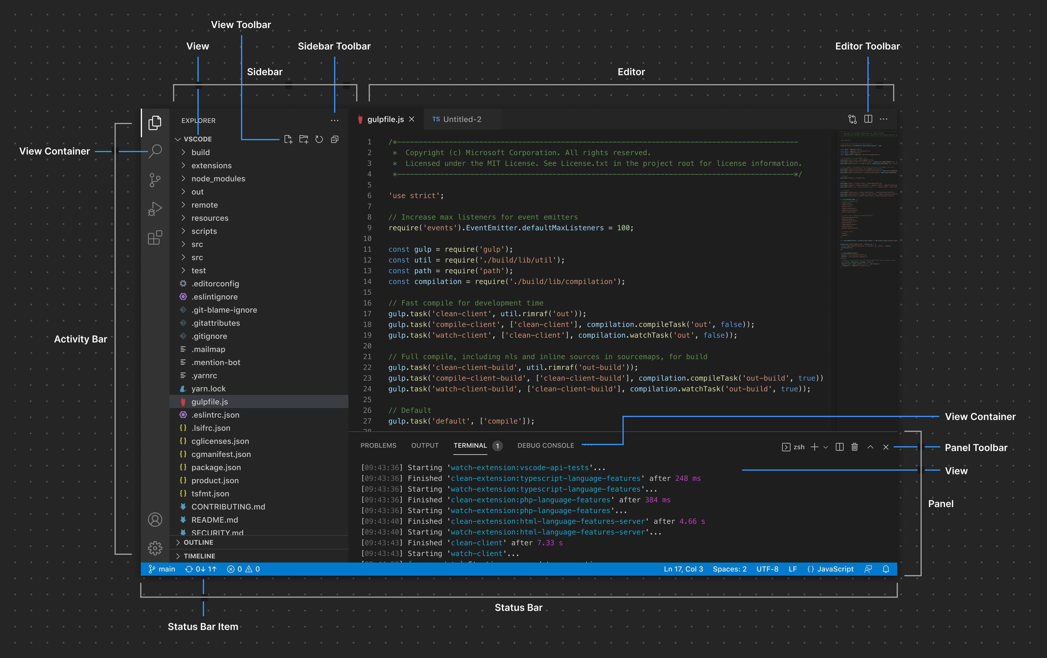
Extensions can add items to the various containers listed above.
View
Views can be contributed in the form of a Tree View, Welcome View, or Webview View and can be dragged around to other areas of the interface.
View Toolbar
Extensions can expose View-specific actions that appear as buttons on a View Toolbar.
Sidebar Toolbar
Actions scoped to an entire View Container can also be exposed in the Sidebar Toolbar.
Editor Toolbar
Extensions can contribute Editor Actions scoped to an editor directly in the Editor Toolbar.
Panel Toolbar
The Panel Toolbar can expose options scoped to the currently selected View. For example the Terminal view exposes actions to add a new terminal, split the view layout, and more. Switching to the Problems view exposes a different set of actions.
Status Bar Item
On the left, Status Bar Items are scoped to the entire Workspace. On the right, items are scoped to the active file.
Common UI Elements
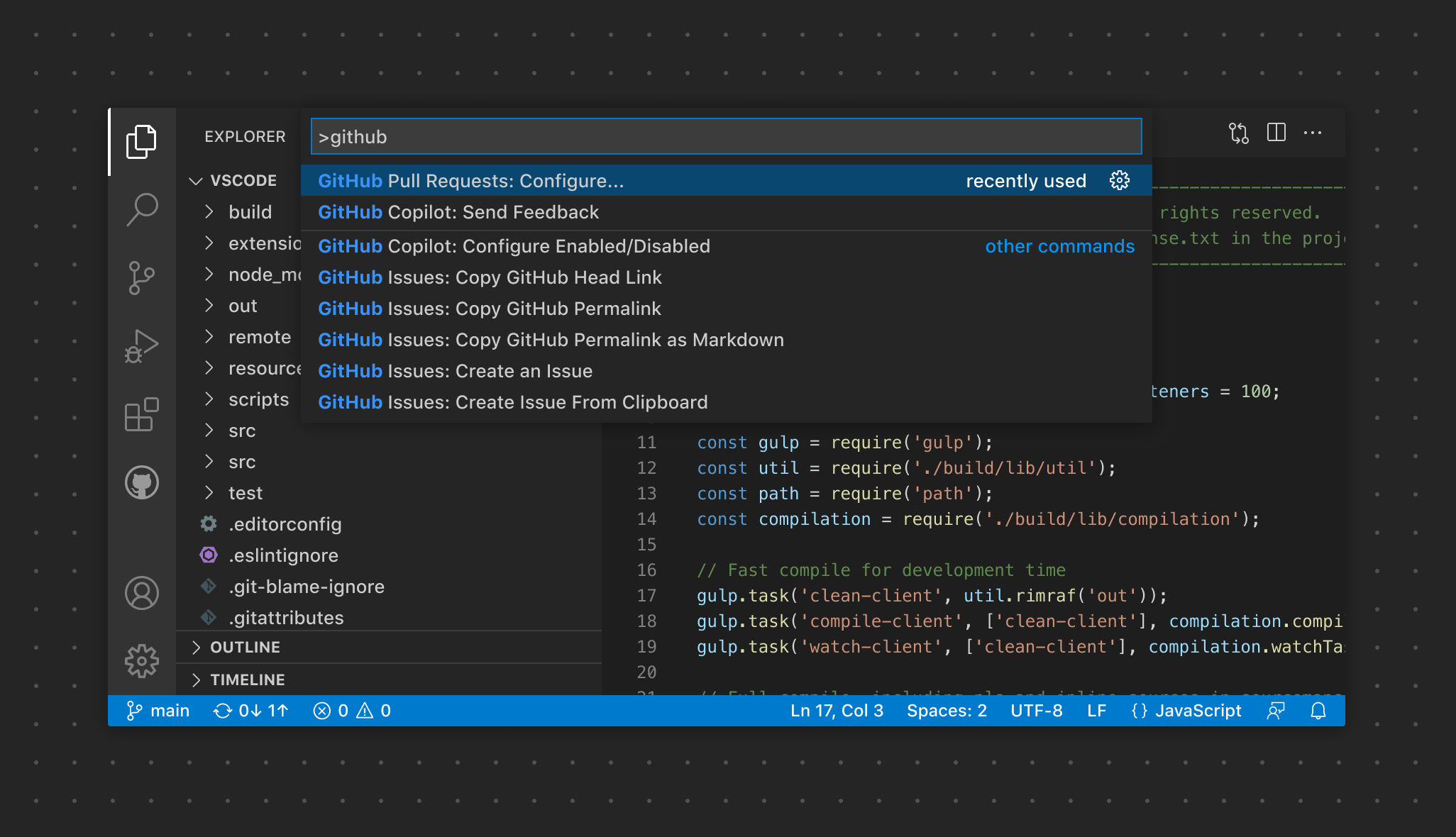
Command Palette
Extensions can contribute Commands that appears in the Command Palette to quickly execute some functionality.
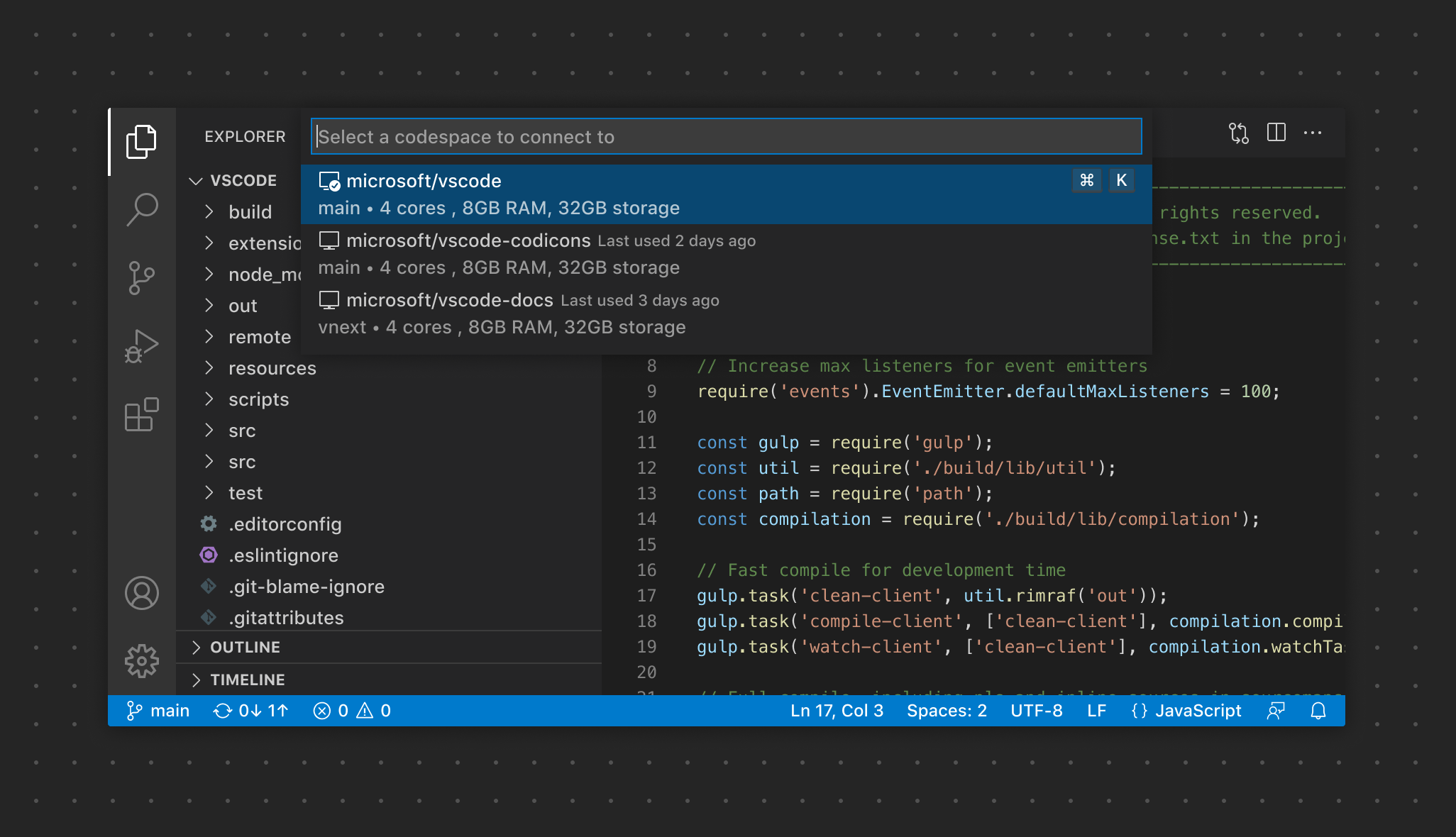
Quick Pick
Quick Picks capture a user's input in several different ways. They can ask for a single selection, multiple selections, or even freeform text input.
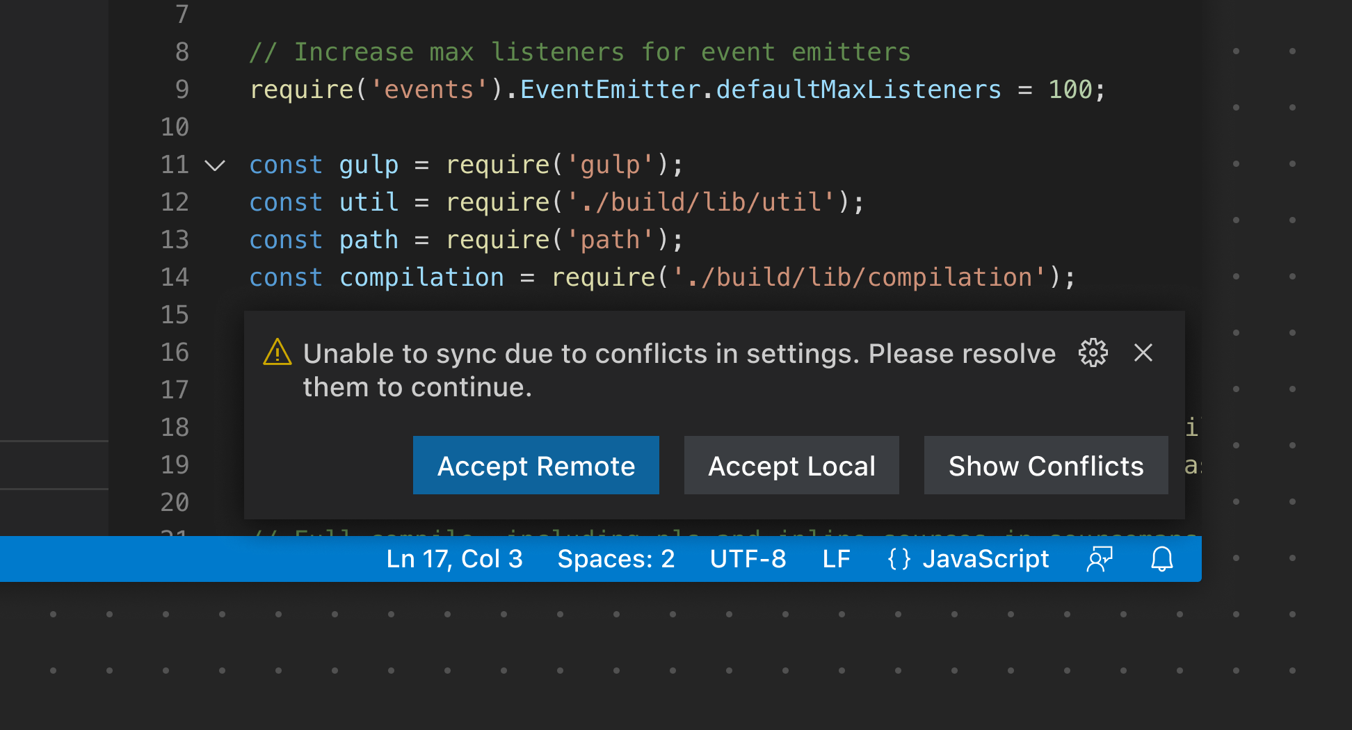
Notifications
Notifications are used to communicate information, warning, and error messages to users. They can also be used to indicate progress.
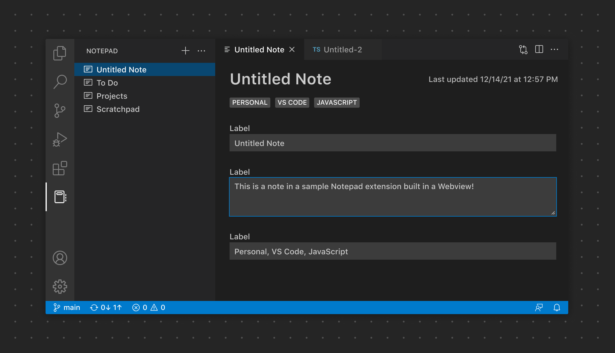
Webviews
Webviews can be used to display custom content and functionality for use cases that go beyond VS Code's "native" API.
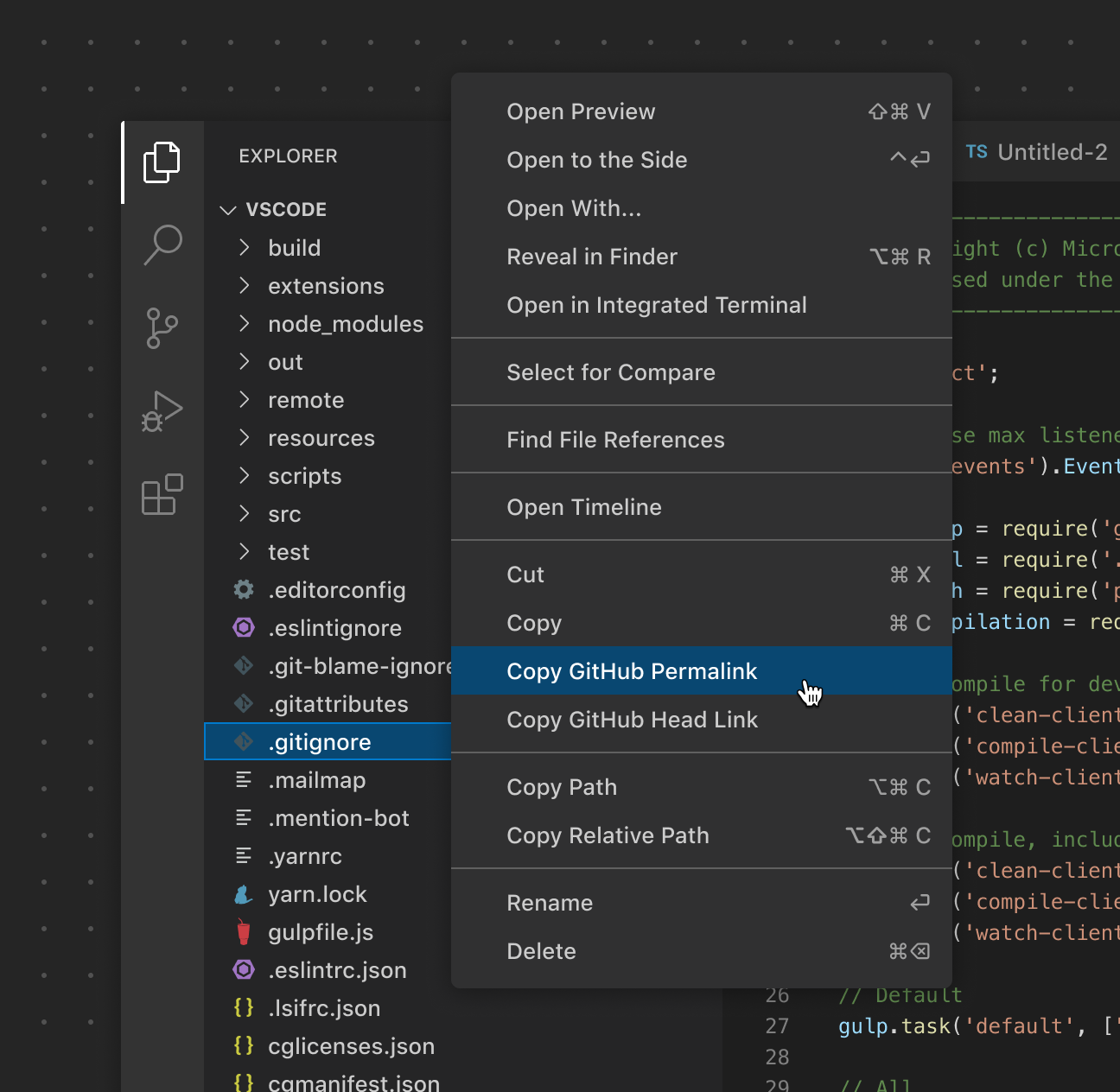
Context Menus
In contrast to the Command Palette's consistent location, Context Menus give users the ability to perform actions or configure something from a specific location.
Walkthroughs
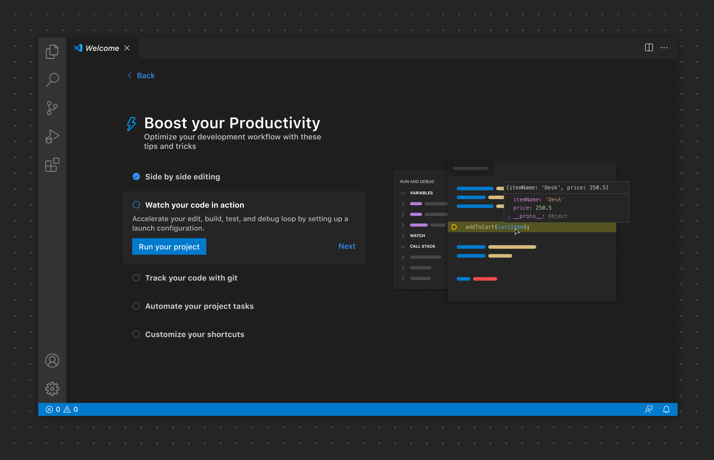
Walkthroughs provide a consistent experience for onboarding users to an extension via a multi-step checklist featuring rich content.
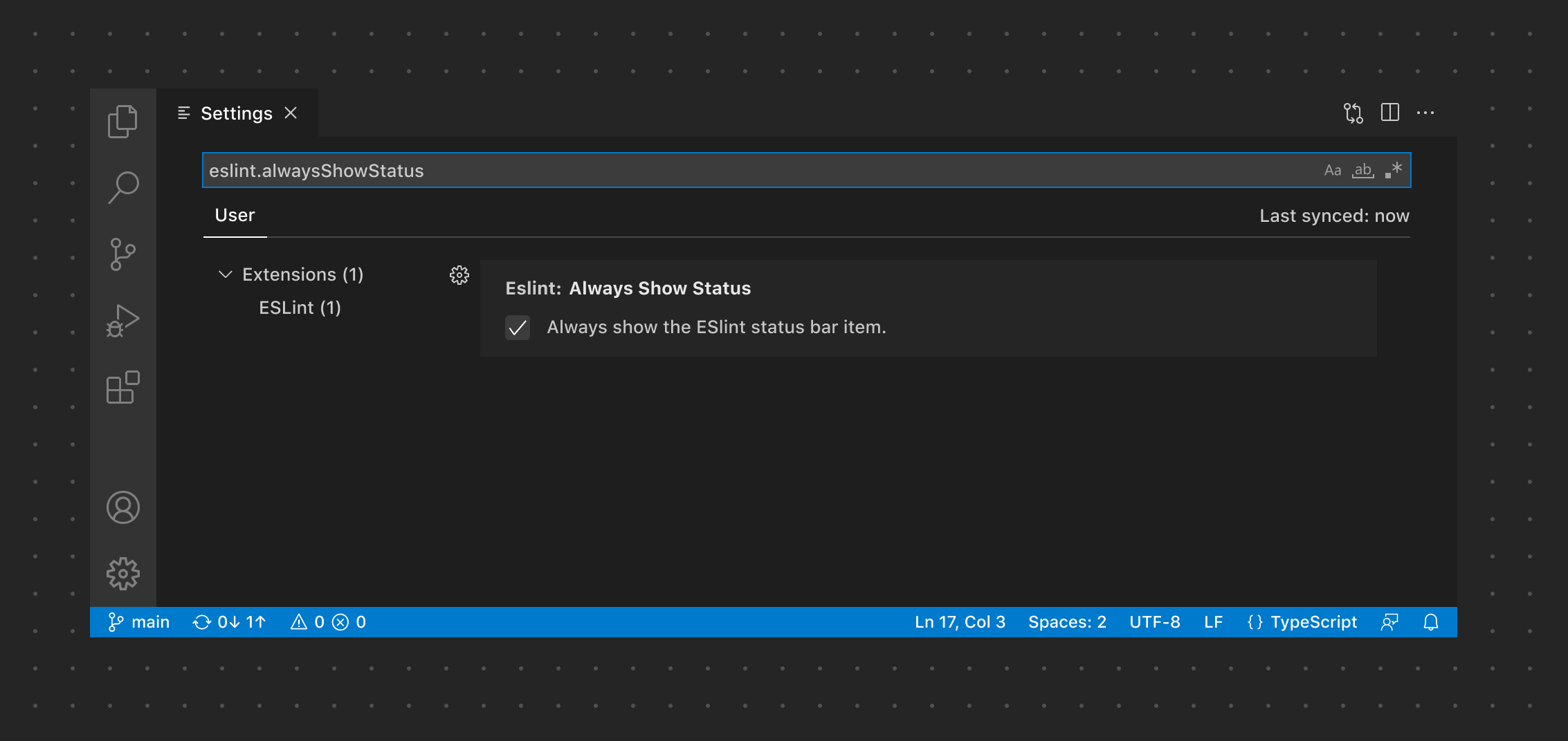
Settings
Settings enable users to configure options relevant to the extension.
